Wadi Media Carousel For Elementor (Pro) Tutorial
Intro
Build your interactive pages with Wadi Media Carousel For Elementor, the widget will help you build the best version of the Elementor carousel you dream of with simple steps and extensive features.
This tutorial will go through all the options available and what you can achieve with each effect.
You can start by checking out Wadi Media Carousel For Elementor Demo Page.
Requirements:
- Install the Latest version of Elementor (free)
- Install Wadi Addons For Elementor Pro (Purchase from Wadi Addons For Elementor Pro Plans).
Activate Wadi Media Carousel
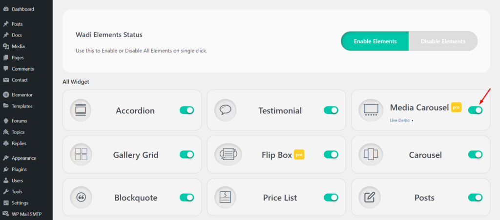
After you have installed both Elementor and Wadi Addons For Elementor Pro, you will need to make sure that Media Carousel is active from the dashboard
- Go to the WordPress admin dashboard.
- Navigate to Wadi Addons For Elementor (Plugin)
- Click on Widgets.
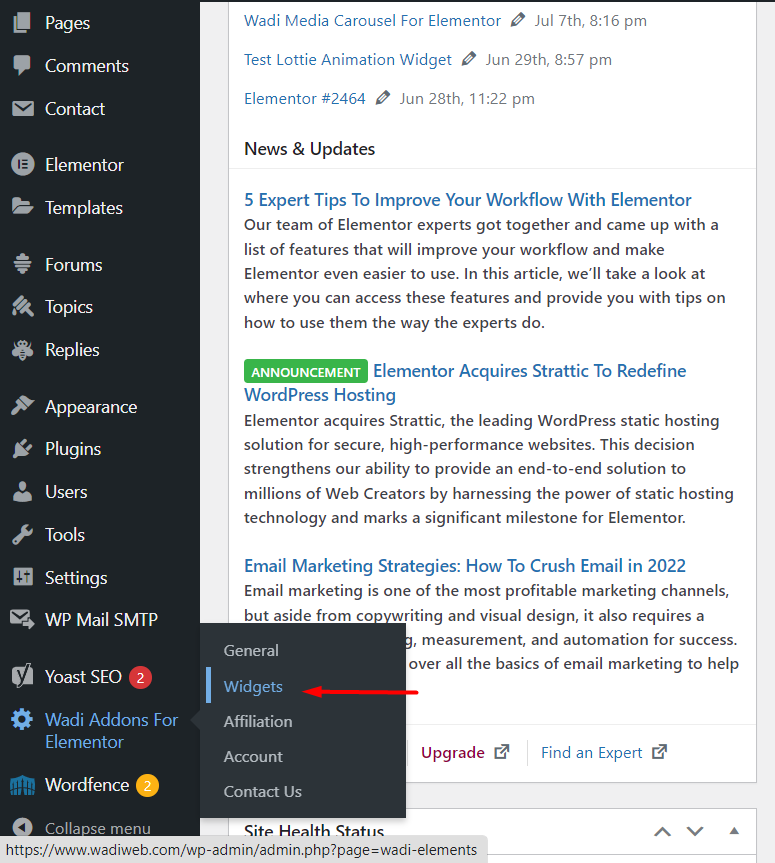
- Enable Media Carousel Widget for Elementor if not already Enabled.
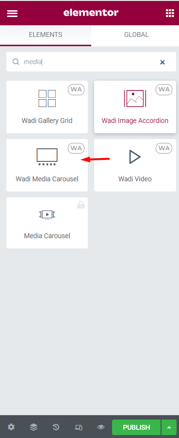
- Now Go to Elementor Templates and Start by creating Elementor Template (Section or Page).
- Choose Wadi Media Carousel For Elementor and Drag and Drop to Start Media Carousel Widget For Elemetnor.
Features
- Media Carousel Content
- Settings
- Advanced Settings
Media Carousel Content
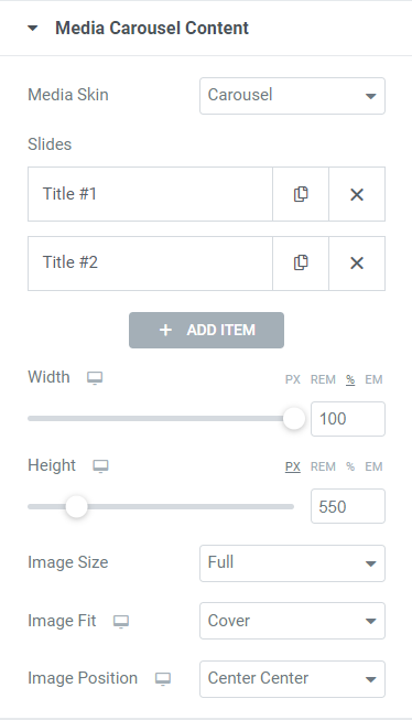
Media Skin
- Carousel: Display basic carousel slides.
- Slideshow: Display images (Media) slides allowing users to navigate through these images (Media) easily and interactively.
Slides
It is a repeater to add Media (images or videos) to your Media Carousel.
Slides content
- Content Slide Type:
- Image: Choose an Image to be added to your Media Carousel.
- Video: Add Video to Media Carousel.
- Slide Title: name each slide
- Image: Select the image that will display on Media Carousel
- Link:
- None: Not link to anything.
- Media File: will link to Image URL. (will generate Lightbox Effect for the image when clicked)
- Custom URL: Redirect to Custom URL (Internal or External) when clicked.
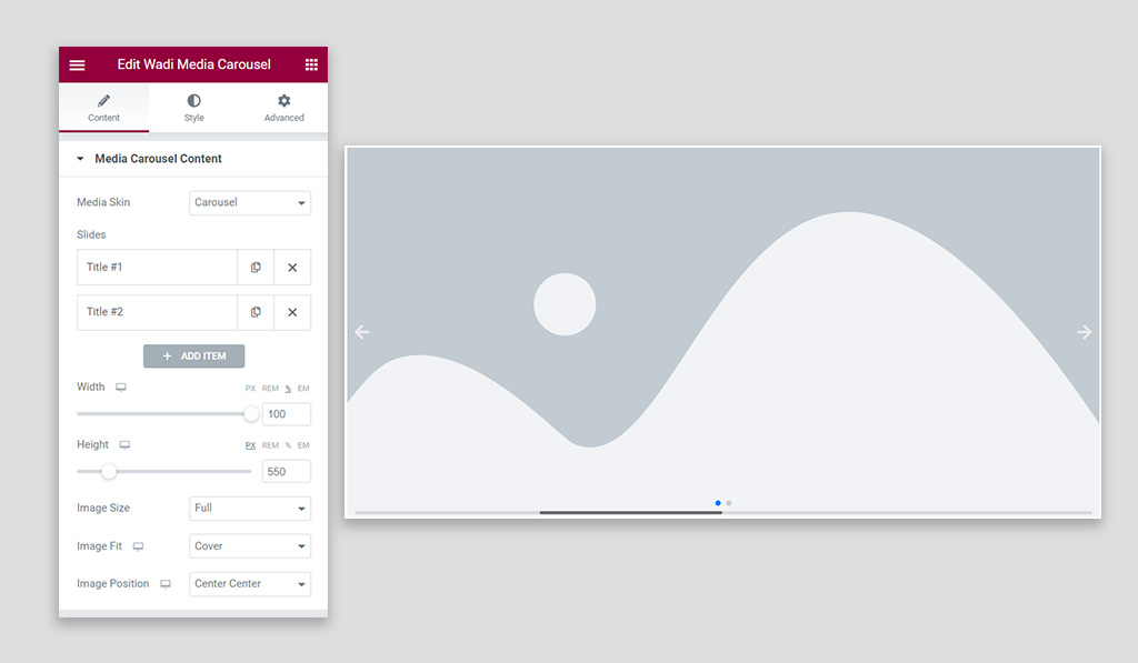
Width: Set the width of Media Carousel [PX, REM, %, EM] (Responsive).
Height: Set the height of Media Carousel [PX, REM, %, EM] (Responsive).
Image Size: set the size of the image.
Image Size available options are:
- Thumbnail
- Medium
- Medium Large
- 1536×1536
- 2048×2048
- Full
- Custom
Image Fit: Set the image fit property
Image Fit available options are:
- Cover
- Contain
- Auto
Image Position: Set the image position property
Image Position available options are:
- Center Center
- Center Left
- Center Right
- Top Center
- Top Left
- Top Right
- Bottom Center
- Bottom Left
- Bottom Right
Settings
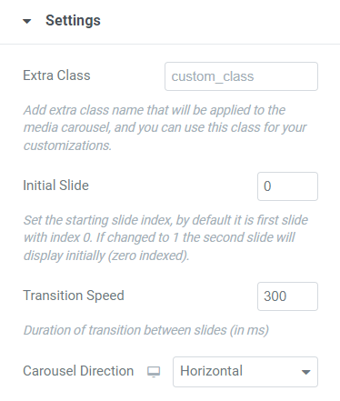
Extra Class: Add an extra class name that will be applied to the media carousel, and you can use this class for your customizations.
Initial Slide: Set the starting slide index, by default it is the first slide with index 0. If changed to 1 the second slide will display initially (zero-indexed).
Transition Speed: Set the Duration of transition between slides (in ms), when increased it will move the slides in slower transition.
Carousel Direction:
- Horizontal: Move Slides from Left to Right horizontally.
- Vertical: Move Slides from Bottom to Top vertically.
Pagination
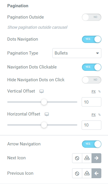
Dots Navigation: Enable (or Disable) Media Carousel Dots Navigation which will show or hide dots navigation from Media Carousel for Elementor.
IF Dots Navigation Enabled
Dots Navigation:
- Bullets
- Fraction
- Progress Bar
IF Dots Navigation is set to Bullets
Navigation Dots Clickable: Make Dots Navigation Clickable allowing you to navigate the Media carousel by Navigation Dots.
Hide Navigation Dots Clickable: Enable (or Disable) Hide and Show Navigation Dots by Click.
Vertical Offset: Set the position of Dots Navigation Bullets vertically.
Arrow Navigation: Enable (or Disable) Media Carousel Arrow Navigation which will show or hide arrow navigation from Media Carousel for Elementor.
IF Arrow Navigation Enabled
Next Icon: Set the Next icon for Arrow Navigation on Media Carousel.
Previous Icon: Set the Previous icon for Arrow Navigation on Media Carousel.
Scrollbar
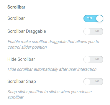
Scrollbar: Enable (or Disable) the Scrollbar navigation indicator of Media Carousel for Elementor.
IF Scrollbar Enabled
Scrollbar Draggable: Enable (or Disable) make scrollbar draggable that allows you to control the slider position using the scrollbar.
Hide Scrollbar: Enable (or Disable) Hide scrollbar automatically after user interaction.
Scrollbar Snap: Enable (or Disable) Snap slider position to slides when you release the scrollbar.
Slides View
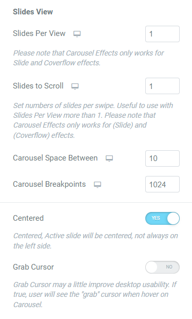
Slides Per View: Set the number of slides per view ( Note that Carousel Effects only works for Slide and Coverflow effects.).
Slides to Scroll: Set the number of slides to slide per interaction (default is one slide [1] ). (Set numbers of slides per swipe. Useful to use with Slides Per View more than 1. Please note that Carousel Effects only works for (Slide) and (Coverflow) effects).
Carousel Space Between: Set the space between slides for the carousel.
Carousel Breakpoints: Set the carousel breakpoints (use carefully).
Centered: Enable (or Disable) Centered, Active slide will be centered, not always on the left side.
Grab Cursor: Grab Cursor may a little improve desktop usability. If enabled, the user will see the “grab” cursor when hovering on Carousel.
Additional Settings
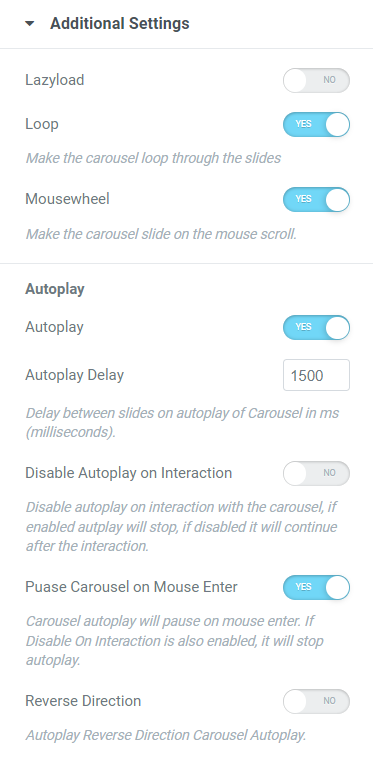
Lazyload: Enable (or Disable) Lazyload mode for Media Carousel, lazyload will load media only when they are on the screen.
Loop: Enable (or Disable) Loop mode, Makes the carousel loop through the slides.
Mousewheel: Enable (or Disable) Mousewheel mode, Make the carousel slide on the mouse scroll.
Autoplay
Autoplay: Enable (or Disable) Autoplay mode, makes the carousel slide automatically without interaction, if disabled carousel will only interact on user actions.
IF Autoplay Is Enabled
Autoplay Delay: Set the Delay of Autoplay when sliding. Delay between slides on autoplay of Carousel in ms (milliseconds).
Disable Autoplay on Interaction: Disable autoplay on interaction with the carousel, if enabled autplay will stop, if disabled it will continue after the interaction.
Puase Carousel on Mouse Enter: Enable (or Disable) Carousel autoplay will pause on mouse enter. If Disable On Interaction is also enabled, it will stop autoplay.
Reverse Direction: Enable (or Disable) Autoplay Reverse Direction Carousel Autoplay.
Carousel Effects
- Slide
- Coverflow
- Fade
- Flip
- Cube
- Cards
IF Media Carousel Effect is Coverflow
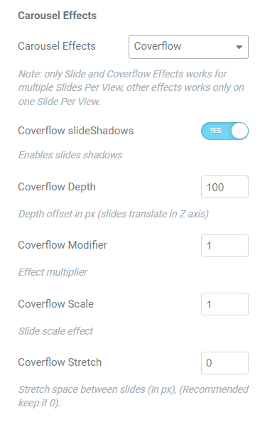
Coverflow slide Shadows: Enable (or Disable) will enable Coverflow Slide Shadows.
Coverflow Depth: Set the depth of Coverflow Media Carousel, Depth offset in px (slides translate in Z axis).
Coverflow Modifier: Set the Coverflow space between slides.
Coverflow Scale: Set Scale of Coverflow Carousel Slides.
Coverflow Stretch: Stretch space between slides (in PX).
IF Media Carousel Effect is Flip Effect
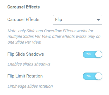
Flip Slide Shadows: Enable (or Disable) Flip Carousel Slide Shadows.
Flip Rotation Limit: Enable (or Disable) Limit edge slides rotation.
IF Media Carousel Effect is Cube Effect
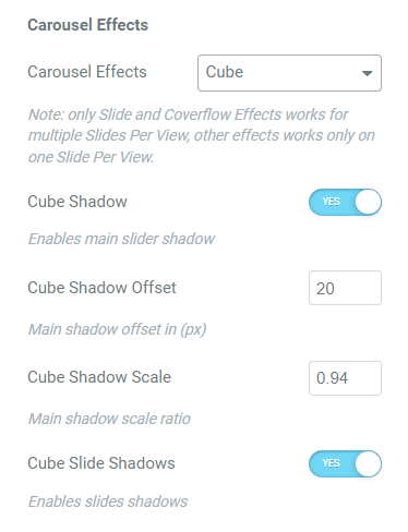
Cube Shadow: Enable (or Disable) Media Carousel Cube Effect Shadow.
IF Cube Shadow is Enabled on Media Carousel Cube Effect
Cube Shadow Offset: Set Shadow Offset in PX for Media Carousel Cube Effect.
Cube Shadow Scale: Set Shadow Scale Ratio for Media Carousel Cube Effect.
Cube Slide Shadows: Enables Slide Shadows for Media Carousel Cube Effect.
IF Media Carousel Effect is Cards Effect
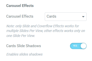
Cards Slide Shadows: Enables Slide Shadows for Media Carousel Cards Effect.
Thumbs Settings
IF Media Skin set to Slideshow
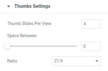
Thumb Slides Per View: Set the number of Thumb Slides to appear on Slideshow Media Carousel.
Space Between: Adjust the space between Thumb Slides on Slideshow Media Carousel.
Ratio: Set the ratio for Thumb Slides Image on Slideshow Media Carousel.
Styling Tab
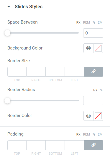
Space Between: (IF Media Carousel Skin is Slideshow) Set the space between the Main Media Carousel and the Slideshow Thumbnail Slides.
Background Color: Set Background Color for Media Carousel Slides Media (Images).
Border Size: Set the Border Size (thickness) for Media Carousel Slides.
Border Radius: Adjust the border radius for Media Carousel Slides.
Border Color: Set the Border Color for Media Carousel Slides.
Padding: Set Padding for Media Carousel Slides.
Navigation
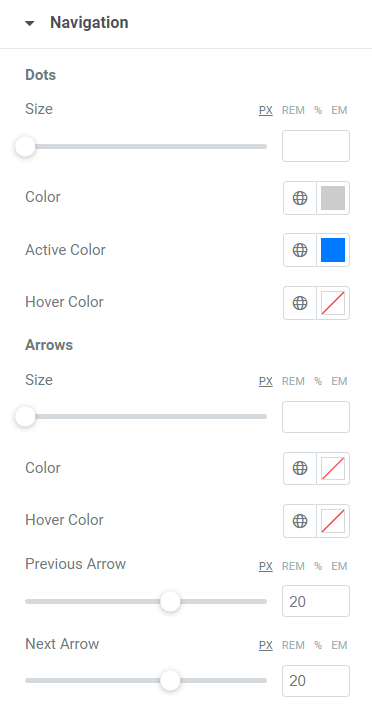
Dots
Size: Set the Size for Media Carousel Navigation Dots.
Color: Choose The Color of the Navigation dots on Media Carousel.
Active Color: Choose the Active Color of The Navigation dots on Media Carousel.
Hover Color: Choose the Hover Color of The Navigation dots on Media Carousel.
Arrows
Size: Set the Size for Media Carousel Navigation Arrows.
Color: Choose The Color of the Navigation Arrows on Media Carousel.
Hover Color: Choose the Hover Color of The Navigation Arrows on Media Carousel.
Previous Arrow: Set the Position of the Previous -Navigation- Arrow on Media Carousel.
Next Arrow: Set the Position of the Next -Navigation- Arrow on Media Carousel.
Scrollbar
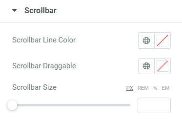
Scollbar Line Color: Choose the Color for Scrollbar Line on Media Carousel.
Scrollbar Draggable: Choose the Color for Scrollbar Draggable on Media Carousel.
Scrollbar Size: Set the Scrollbar Size [ Height or Width depending on Media Carousel Direction (Horizontal, or Vertical) ] on Media Carousel.
Lightbox
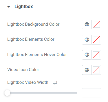
Lightbox Background Color: Choose Media Carousel Lightbox Background Color.
Lightbox Elements Color: Choose Media Carousel Lightbox Elements Color.
Lightbox Elements Hover Color: Choose Media Carousel Lightbox Elements Hover Color.
Video Icon Color: Set the Color for Media Carousel Video Icon.
Lightbox Video Width: Set the Width of Video on Media Carousel Lightbox.